Tama Paintings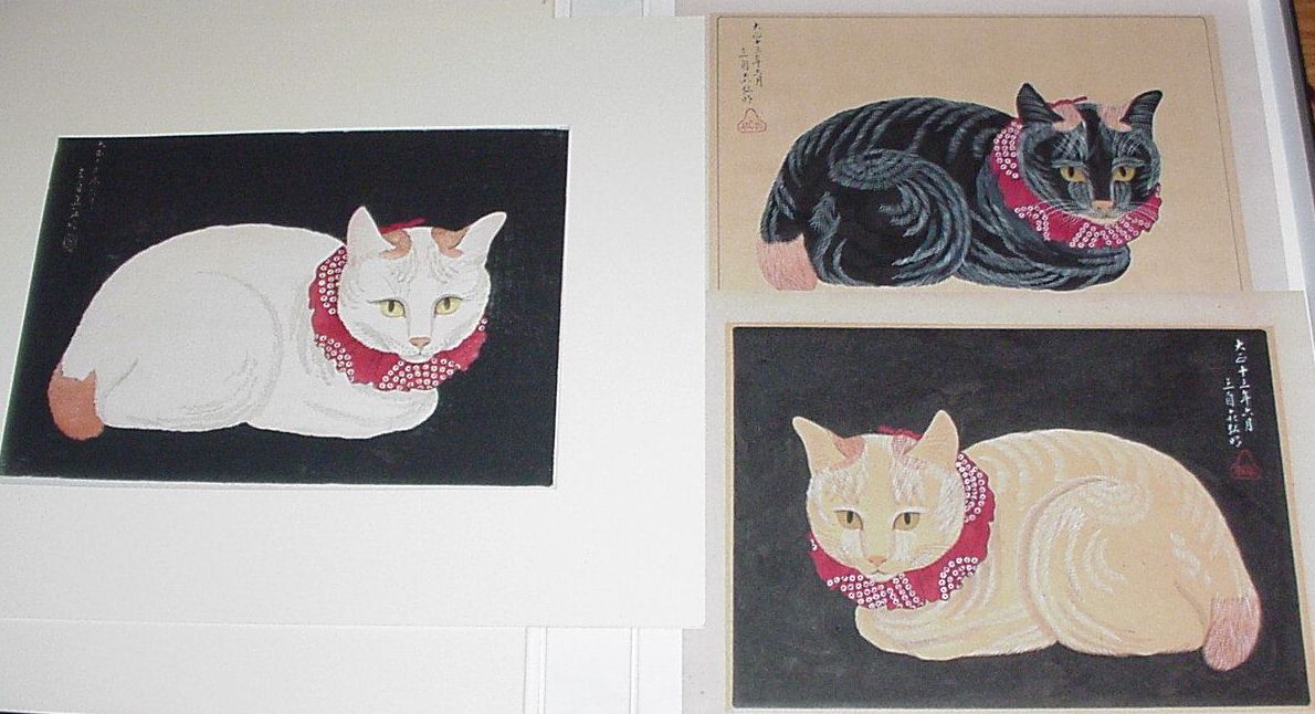
Here are 3 cats from my collection. The woodblock printed cat on the left is a later edition of Hiroaki's "White Cat on black background", also known as "Tama". The two cats on the right are paintings on paper, not prints, signed "San Ji Sai Hiroaki" and sealed "Shôtei". The paintings are either:
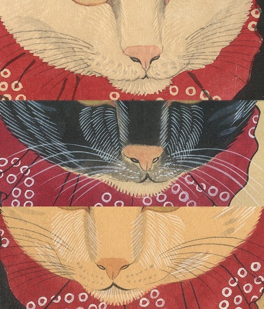
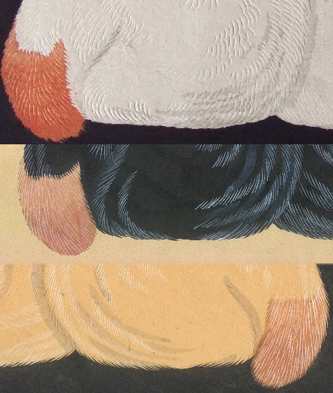
The purpose of this web page is to examine the evidence in an attempt to decide what to call these paintings. It is most likely that the truth of this matter will never be definitively known. HistoryThis print is "E-1" in Watanabe's post-earthquake inventory numbering system. The "E" prefix was reserved for Hiroaki oban prints. "1" implies that this was the first Hiroaki print produced by Watanabe after the quake. The date on the print is June, 1924 (Taisho ju-san nen roku gatsu), just 9 months after the great Kanto quake which happened in September, 1923.While there is not any title text on the print itself, Watanabe's catalogs list this print's title as "White Cat on black background". Somewhere along the line it became known as "Tama" which is a common Japanese name for a cat. It seems to have been a popular image, having been through multiple printings. Copies have been seen bearing a variety of publisher's cartouches and other markings. ComparisonsHere are some like details from each cat, for comparison. Click on any of the images for a higher-resolution view.Snouts and Tails
Dates, Signatures, and Seals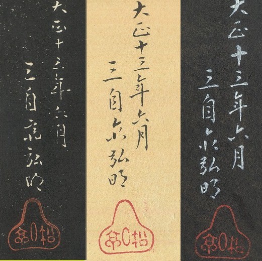 On the left is the date, signature and seal of the print.
It is clear that the seals on the paintings are impressions stamped from the same carved seal. The seal on the print is a facsimile, but from a different carved seal or print block. The handwritten text reads, from top to bottom / right to left, "Taisho ju-san nen roku gatsu. San ji sai Hiroaki" The first part is the date, June, 1924. The second part is a typical Hiroaki signature. Tosh Doi, an interested hanga collector from Tokyo, says:
DimensionsThe following dimensions are all in centimeters. They are close to each other, but not exactly the same.
The Paper The paper that these are painted on is quite surprising. It doesn't appear to be
a Japanese paper. It's got more of the consistency of a western poster
board. The dimensions are 11 3/8" x 15 3/8". The major area of the
paper is a rectangle that has been embossed upwards, with about a 1"
margin around each edge. The internal raised rectangle is 9 3/8" x
13 3/8".
The paper that these are painted on is quite surprising. It doesn't appear to be
a Japanese paper. It's got more of the consistency of a western poster
board. The dimensions are 11 3/8" x 15 3/8". The major area of the
paper is a rectangle that has been embossed upwards, with about a 1"
margin around each edge. The internal raised rectangle is 9 3/8" x
13 3/8".
Oddly enough, the raised area has been mechanically printed with a flat tan color, about the same color as heavy toning. But it's not toning; it was printed. It's obvious that the embossing and printing of the rectangle preceded the painting. The color of the beige cat is the color of the printed area of the paper That's an odd "blank sheet" to
start with. I can only think that the earthquake disrupted the normal
supply pipelines, and the artist had to make do with what was available.
My ThoughtsIn my heart, I believe that these paintings were done by Shôtei as preliminary studies for the Tama print. It is perfectly understandable, and quite welcome, that this belief be met with skepticism. This is a gray area where the truth may never be known. The main purpose of this page is to solicit, from the hanga community, opinions and strategies to use to clarify the question of the legitimacy of these paintings.A bit of historical fiction...Here's how I think it happened:In the months after the disaster of the earthquake, the people of Tokyo were working to salvage what they could and to rebuild their lives. There was nothing left of Watanabe's business. Scrambling to make a new start, he had Shôtei re-construct some of his previously successful "tourist" prints (mitsugiri-ban and smaller) favored by Westerners. These prints were the early money-makers for Watanabe and would likely provide the fuel for his recovery. In the midst of this laborious re-construction of his old designs, Shôtei felt the need to design something new. He had done about a dozen oban landscape prints in the few years prior to the earthquake, but never any portraits of people or animals. Supplies were scarce, but he found this odd paper and prepared this study of 2 cats, kind of a yin/yang composition if hung as a pair. Watanabe, stretched thin with his rebuilding, decided to do only one of them. The composition of the black cat painting felt better, but the white cat body would do a better job of featuring the embossing. So, that's what they did. When it came time to write a descriptive title for his catalog, Watanabe called the print "White cat on a black background". Could he have chosen that title to distinguish it from the black cat on a white background that he decided not to publish? Your ThoughtsI welcome your emailed comments, questions, and suggestions. Please let me know if it is OK to publish your thoughts here or if you would rather not.
| |||||||||||||||||||||||||||||||||||||||||||||||
| Home | Copyright 2002 by Marc Kahn; All Rights Reserved | ||||||||||||||||||||||||||||||||||||||||||||||