|
of Trip to Japan 1909-1910 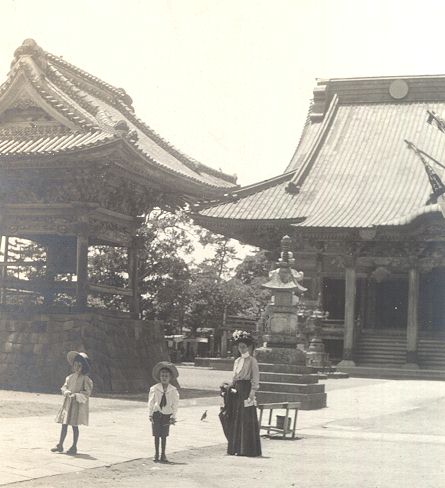 Today, travel to Japan is easy. You board an airplane. In a matter of hours, you find yourself in Tokyo. It's almost routine. In the early 1900s, the journey was by steamship and took weeks. It was a major commitment of time and money to visit the far east, and certainly the occasion to collect some fine souvenirs. During their stay in Tokyo, someone in the Weeks family visited the new Watanabe Color Print Company and purchased at least 30 copies of their beautiful woodblock prints. These were glued around the edges and attached to a scrapbook made of high quality Japanese backing paper which seems to have been sized with mica, to make it sparkle. Photographs of the family (see example above) and picture postcards were also mounted in the scrapbook. Fortunately, the backing paper is very stable and has caused no toning whatsoever to the attached prints.
In February, 2002, the pages of this scrapbook were separately auctioned by an ebay seller in Las Cruces, New Mexico, who had received it for disposal as a consignment. The Shôtei prints went for as high as $350.00 each. In addition to purchasing a few of these prints, I have captured all of the images from the auction listings, which are displayed on these pages: The surfacing of the Weeks family scrapbook is an event which offers us a window into the early
days of Watanabe Color Print Company.
We can see an early sequential print numbering system where numbered cartouches were carved into the
blocks.
There are multiple pre-earthquake variants of some of the prints with which we are quite familiar
in their post-earthquake manifestations.
Also, the sizes of the prints are a bit different than what we see in the later work.
Numbered Cartouches Most of the 17 Shôtei images in the Weeks scrapbook have numbers contained in cartouches which
were carved into the blocks located near the Shôtei seal.
The majority of the cartouches are fan shaped, but two are shaped like a 5 petaled flower.
Of the hundreds of Shôtei prints that I have cataloged, I have previously seen this type
of cartouche only twice, on prints
M-72 and
S-4.
None of the scrapbook's Sôzan or Hiroshige prints have these numbers.
Most of the 17 Shôtei images in the Weeks scrapbook have numbers contained in cartouches which
were carved into the blocks located near the Shôtei seal.
The majority of the cartouches are fan shaped, but two are shaped like a 5 petaled flower.
Of the hundreds of Shôtei prints that I have cataloged, I have previously seen this type
of cartouche only twice, on prints
M-72 and
S-4.
None of the scrapbook's Sôzan or Hiroshige prints have these numbers.
The numbers are unique to each image. There are no repeats. These must be Watanabe catalog numbers. The highest number that I've seen is number 46 on print M-72. Prior to the earthquake in 1923, Shôtei designed some 500 images for Watanabe. The conclusion that I'm drawing from this is that in the Weeks scrapbook, we are looking
at some of the earliest of Shôtei's production.
Soon after 1910, they stopped using numbers in cartouches in the image, else we would be seeing
some higher numbers in the pre-earthquake prints which are surviving today.
Print SizesIt's hard to draw any definitive conclusions about this, but I'm noticing that most of the Shôtei prints in the Weeks scrapbook have a "longer" shape than the ones that I'm used to seeing. The classical oban sized print is 1 ½ times as long as it is wide. Chuban and koban prints also maintain (more or less) this ratio. The exception, for Shôtei's later work, is the mitsugiri-ban format where the ratio is about 2.3 to 1.In this scrapbook, we have pillar prints which are almost 4 to 1.
There are also some smaller prints about 10 inches (25 cm) long which maintain the mitsugiri-ban
ratio with a width of 4 inches (10 cm).
Even some of the mitsugiri-ban prints have widths of less than the "normal" 6 ¾ inch
(17 cm) width, with one of them down to 5 inches (12.5 cm), giving a 2.9 to 1 ratio.
Cost Containing Measures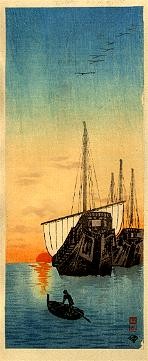 All of the prints in the Weeks scrapbook are lacking margins.
At first, I thought that they had all been trimmed off, but then I noticed the registration marks on many
of them in the lower right corner and about 2/3 of the way up the right side.
You can see the missing pigment in these two places on the print to the right.
The area around the print which looks a bit like a margin is actually the backing paper.
All of the prints in the Weeks scrapbook are lacking margins.
At first, I thought that they had all been trimmed off, but then I noticed the registration marks on many
of them in the lower right corner and about 2/3 of the way up the right side.
You can see the missing pigment in these two places on the print to the right.
The area around the print which looks a bit like a margin is actually the backing paper.
Current day woodblock printmaker, David Bull says, "In this print, the publisher has been very stingy and has tried to get as many printable sheets as possible from the large sheets from the papermaker. The ideal way to make a 'bleed' print like this is to start with a larger piece, print it with the background colour extending a little beyond where the final print size will be, and then trim the thing to size later. This is the way I do all my bleed type prints. When it is done that way, any kento stains, etc. are trimmed off ... "But these guys cut the paper to the final size right at the beginning (obviously getting more prints per sheet, because there are no waste margins being trimmed later). The two areas that didn't get smooth colour are the two places where the registration marks have been carved down into the surface of the wood - actually carving into areas that should be printing zones." I have removed one of my prints from the backing paper and was surprised that the paper was very thin.
"Common knowledge" amongst shin hanga collectors is that older prints are on thick paper and newer
prints are on thinner paper.
The Weeks scrapbook shows that this is not necessarily so.
Cutting the prints to size before printing and using thin paper are both consistent with an effort to
contain costs.
From the publisher Watanabe's point of view, it is clear that these were "just" tourist prints and not worthy of a
"deluxe" treatment.
| |
| Home | Copyright 2002 by Marc Kahn; All Rights Reserved |
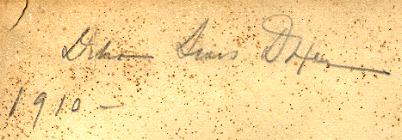 The signature to the right, found in the scrapbook, which may read _____ Sears Dixon,
is clearly dated 1910.
The prints which were mounted in the book included 21 Shôtei prints, 7 prints by Itô
Sôzan, and 2 Hiroshige reproductions.
This distribution of prints is entirely consistent with what we know about Watanabe's early operation.
Takahashi Shôtei was the first artist to design for Watanabe, specializing in landscapes.
Watanabe's second artist was Itô Sôzan, who did mostly birds and flowers.
The 1910 date is entirely believable.
The signature to the right, found in the scrapbook, which may read _____ Sears Dixon,
is clearly dated 1910.
The prints which were mounted in the book included 21 Shôtei prints, 7 prints by Itô
Sôzan, and 2 Hiroshige reproductions.
This distribution of prints is entirely consistent with what we know about Watanabe's early operation.
Takahashi Shôtei was the first artist to design for Watanabe, specializing in landscapes.
Watanabe's second artist was Itô Sôzan, who did mostly birds and flowers.
The 1910 date is entirely believable.