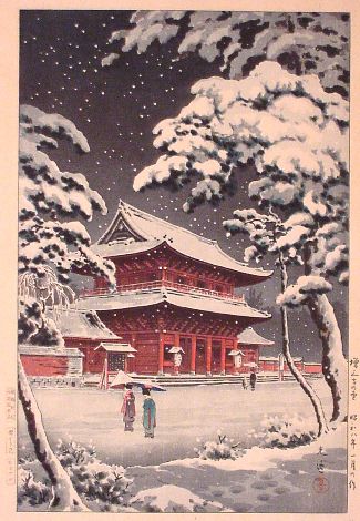
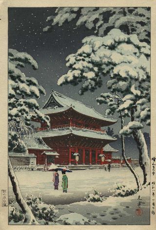
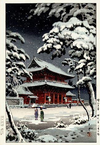
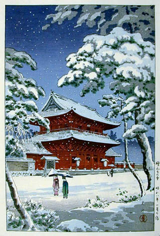
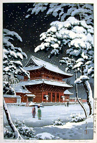
Examples:Here are 5 different copies of this 1933 Tsuchiya Koitsu print:
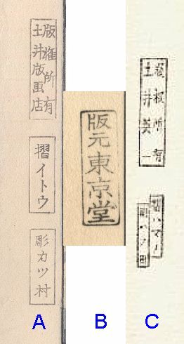
In an article about Doi seals on the Ukiyoe-Gallery.com website, it is stated that prints labelled "Doi Hangaten" weren't produced until 1946 and that prints labelled "Hanmoto Tokyo-do" are probably pre-war prints. If it is true that print A pre-dates print B we will have to revise our history to say either that Tokyo-do was used post-war or Doi Hangaten was used pre-war. I believe that the evidence is conclusive because:
Key-block comparison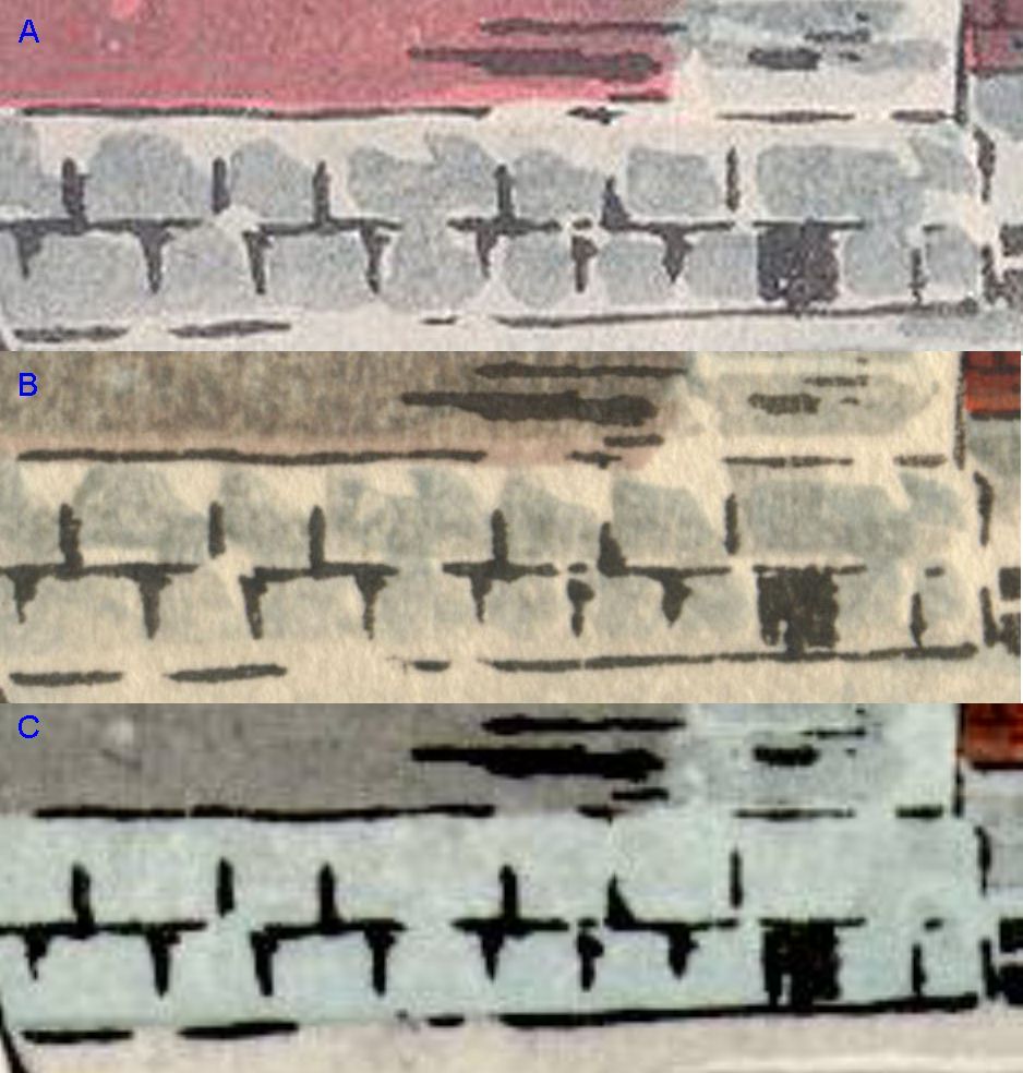
Commentary on comparison of A and BRoss Walker says, "The keyblock lines for these two prints come from the same keyblock. After comparing these lines at quite high magnifications (in Photoshop), there is far too great a similarity between the characteristics (shape, boundary curves, etc.) of each of the individual black lines for them to have been made from different keyblocks." His methodology is to use a "Photoshop file with the two images overlayed so that you can compare the two by varying the transparency of the upper layer. This is about the only way you're going to see any differences between the two clearly." Commentary on CPrint C in this comparison is not as high definition and is somewhat pixellated as a result of expanding it. However, it seems to have come from the same key-block as A and B.Horizontal border gaps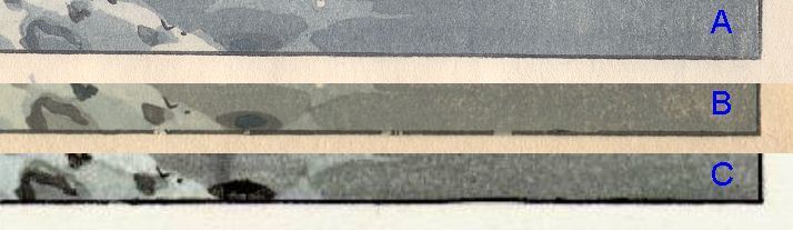
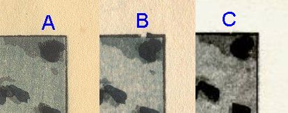 The breaks in the horizontal borders on print B are the result of damage to the keyblock from printing.
The key-block was repaired sometime between the printing of B and C.
On C, the breaks are gone, but the smoothly straight line of A has become discontinuous
as a result of the mended block.
The breaks in the horizontal borders on print B are the result of damage to the keyblock from printing.
The key-block was repaired sometime between the printing of B and C.
On C, the breaks are gone, but the smoothly straight line of A has become discontinuous
as a result of the mended block.
Note that some of these breaks are also evident in print D, although it is hard to see in the
low resolution image.
Registration problems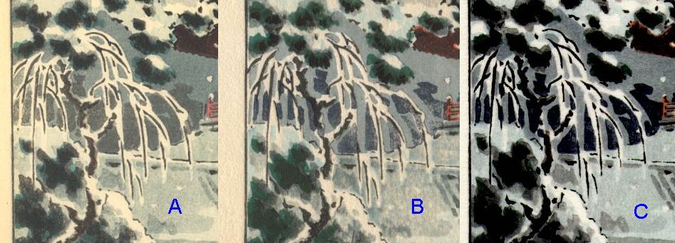
Prints B and C have some registration problems in some of the color blocks.
The shadow block between the branches shown here is pretty bad.
The cause of this is old blocks which have aged differently causing them to get out of alignment.
Artists seals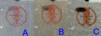 Here we can see that there was some re-carving that happened between A and B.
I've got to wonder why they would re-carve the artist's seal and not recarve the block shown above
which is so out of alignment.
Here we can see that there was some re-carving that happened between A and B.
I've got to wonder why they would re-carve the artist's seal and not recarve the block shown above
which is so out of alignment.
| |||||||||||||
| Home | Copyright 2002 by Marc Kahn; All Rights Reserved | ||||||||||||