Color StabilityBefore the prints that we collect today were printed, the coloration was determined collaboratively by the artist and the printer, under the supervision of the publisher. It was an iterative process, with multiple attempts to get "just the right" colors. For various reasons, the prints that are available in today's marketplace often have colors which are quite different from when they were freshly printed. Examples of Color Damage: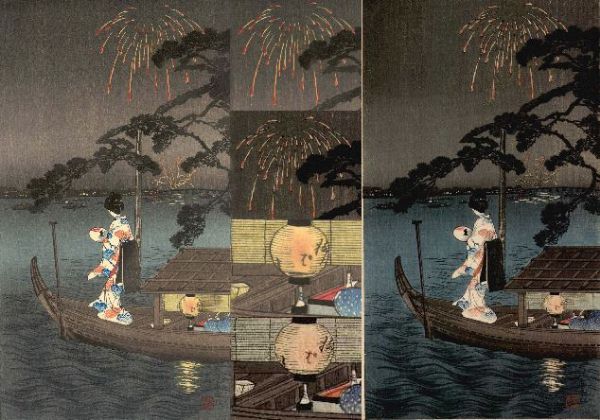 The print on the left is one of four Shôtei prints which came up for sale in March 2002 on ebay in a single auction lot. The collector who bought them reports that they are pristine and have never seen the light of day. The print on the right has been previously framed and exposed to the light. It has lost almost all of its yellow tones. 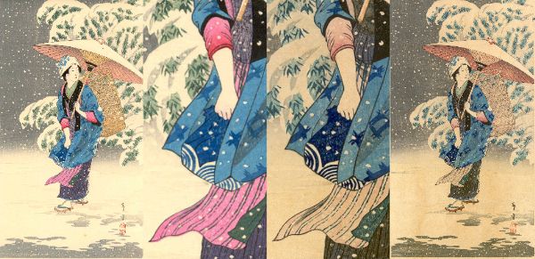 The pristine print on the left, from the same lot of four, is strikingly different from the one on the right, which has been exposed to the light. The pink apron has degenerated to tan and the foliage has turned from green to blue. It seems that the pink pigment was especially susceptible to light damage. Also, as in the above example, the yellow component of the green has gone, leaving behind a blue pine tree. The argument could be made that the tan apron is a color variant and wasn't originally printed as pink. It's a possibility, but the faint snowflakes against the tan, both on the apron and the sleeve, don't have enough contrast to make sense. I'm convinced that both of these prints started out with the same colors.  Here is a kacho-e snow scene by Yoshimoto Gesso. The "snow" was splattered onto the surface of the finished print as an opaque white called gofun. It is turning brown. ResearchThe 1984 book, "Japanese Woodblock Prints: A Catalogue of the Mary A. Ainsworth Collection", by Roger S. Keyes contains an article called "Identification of Traditional Organic Colorants Employed in Japanese Prints and Determination of their Rates of Fading" which was written by Robert L. Feller, Mary Curran, and Catherine Bailie. This article describes a research project in which the authors used a device called a spectrophotometer to identify specific colorants within an old block print. They then subjected small areas of the print to intense light both directly and through an ultraviolet filter. Finally, they analyzed the extent of the damage on the print.This article is about 14 pages long and their analysis is quite rigorous. There were, however, some generalizations which can be made about the results.
Although they didn't directly research color darkening, the article mentions that some colorants (especially inorganic ones) can become darker due to either light exposure or chemical reactions. The Bottom LineUntil just recently, I was an advocate of framing my shin-hanga prints and displaying them. I felt that by using UV filtering glass and avoiding bright places, I was justified in trading a very minimal damage in return for the ability to be surrounded by my beauties.This is no longer the case. All of my prints are coming down from the wall and getting stored in an archival environment. Even "a very minimal damage" is unacceptable. An Interesting ExperimentMy colleague, Thomas Crossland, sacrificed a couple of prints to document the effect of direct sunlight. He used both regular and UV filtering glass. This is all on display at his Ukiyoe-Gallery website. | |
| Home | Copyright 2002 by Marc Kahn; All Rights Reserved |